
Figures
& Faces

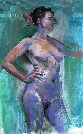
NUDE FIGURES
Message
I feel that my best inspiration comes from direct observation. This dates back to the days I drew directly from medical school dissection bodies, to understand underlying structure.
As I now take advantage of opportunities for working directly from professional (live) models, this Gallery's figure studies are explorations; a learning process for me with no particular ‘message’ intended. They are each created in less than 3 hours, because that’s the typical shared model time-frame for posing.
When economically re-using the same archival-quality pastel papers several times over again, the successive paintings are often enriched by artifacts from my scraped previous underlying images.
Color choices
People ask all the time about my sometimes unorthodox color choices, especially for skin tones. Here’s the quick response to the questions: I see these colors in the subject, and then use them. But the variations of those colors are actually chosen both ‘viscerally’ and cognitively...
What I reach for is the color variation I see in particular lights; sometimes reflected lights, that makes me smile and that energizes me. Equally important is to consider the particular intensity of each color-- perhaps using a bright version would enable that area to jump forward or to draw the viewer's attention? Or is a duller color tone needed, to allow other parts of the painting to accomplish those things?
So the selection can become less about the hue, the color itself, and more about a personal connection, and about the contribution it’s making to suggest a 3-D illusion, or to guide compositional flow. These choices can make a piece sing, or be over-self-conscious, or fall flat.
Edges
Edges of a form can be especially expressive! I love seeking the variations - that an edge can be represented by a sharp line, maybe with a progressive thickness or weight to convey motion. Or could an edge be suggested by the meeting of contrasting areas of color or texture? And it can be just blurred away, for less emphasis. Like with color, of course, how each part of a form’s edge is painted is meant to contribute to the entire compositional flow.
Media
I’ve loved the vibrant media of pastel chalks, and often combine them with some watercolor under-painting to more quickly cover the surface in general tones, particularly in darker areas. This media combination also enriches the range of textures. More about these media
I look for this media’s own natural textures to help animate the composition and it’s parts. I’m not happy attempting to portray most of the qualities I see with a consistently smoothed-out or uniform painted surface.
Message, color, edges, texture, media
are all, for me, in the service of exploring anatomy
Click on an image to view enlarged gallery


